At the end of round 2, I thought it would be good to do an update on the progress of the tournament, and look at some trends that have emerged.
One thing that I thought I would focus on is how the runs have been scored, rather than just how many.
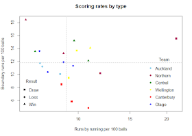
I looked at each innings and looked at the total runs from boundaries, and the total other runs (I called them run runs, but they include no balls and wides, as they were too hard to separate).
I plotted them on a graph, to see if there were any interesting patterns emerge.
There were a couple of things that I noticed. Auckland, Otago, Wellington and Canterbury have all had similar rates across the different innings that they've batted, while Northern Districts and Central Districts have had more variety in how they've accumulated their runs.
The triangles seemed to be higher up the chart on average, with all of them being above the median boundary rate, so I thought that I'd see if there was a correlation between the rates and the total competition points gathered in a match.
There is a reasonably strong relationship between the boundary rate and the points earned in a match, however, there's almost no relationship at all between the speed of accumulation of non-boundary runs and the points earned.
There is a theory that regularly rotating the strike makes it easier to survive a match, as it doesn't allow the bowlers to settle. I certainly know that I hated batsmen hitting singles off my bowling, and I remember Dale Steyn saying in a press conference something to the effect of "I don't mind dropped catches that much. Dropped catches happen. But I get really upset when a fielder lets a batsman get off strike when I had him under pressure."
Of the 7 innings played by a losing side, 5 of them had a run-runs rate below the median. That made me wonder if there was a pattern there. I looked at the final innings by teams that batted out a draw or lost, and looked to see if there was a difference in the rates for the teams that lost vs the teams that drew.
This graph isn't particularly meaningful at the moment, with only 5 innings to look at, but I intend on building this up as the season goes on.
Looking at it as individual points makes it more clear:
I've circled the point at the bottom, because that was an innings where Canterbury lost their last wicket with only 6 balls remaining, and so it was very close to being a saved match. Interestingly the teams that have scored a lot of boundaries have lost, but it is a very small sample to be drawing too many conclusions from.
The final table, with other information, looks like this:
This made me wonder which correlation was stronger, scoring rate with total points, or the traditional value of Net Average Runs Per Wicket (batting average minus bowling average).
The Net Average Runs Per Wicket seems to be a better predictor of success, but there is a clear relationship with the scoring rate also.
I'll be interested to see how these develop as the season progresses, but for now we seem to have a separation between the sides, with Auckland, Canterbury and Otago all needing to find another gear for the next round.


I would like to see data on % of dot balls to total balls faced. Watching some of the Shield game in Wellington the Otago batsmen really struggled to keep the scoreboard moving in their second innings.
ReplyDeleteI'll see if NZC will give me that data for the next round. It's a bit hard to get off their site.
Delete